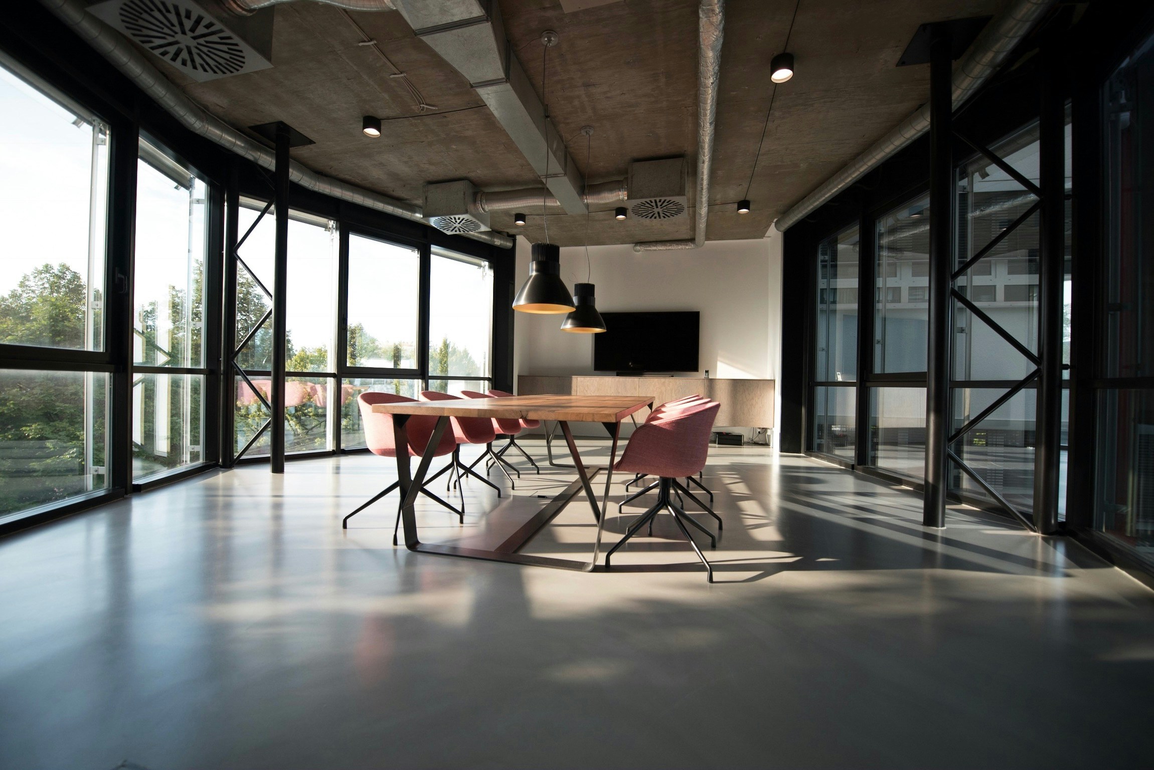
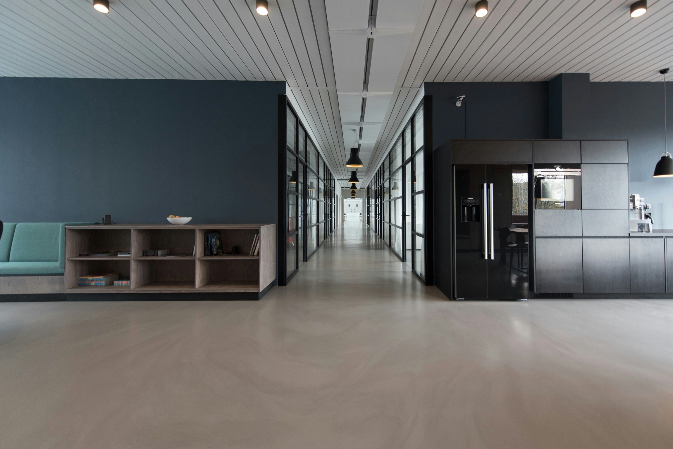
Minimalist design is more than just a trend; it's a philosophy that emphasizes simplicity, clarity, and the beauty of essential forms. The mantra "less is more" perfectly encapsulates this design approach, where every element serves a purpose and nothing is superfluous.
Principles of Minimalist Design
Simplicity: Strip down the design to its fundamental elements. Remove anything that doesn't serve a clear purpose.
Focus on Functionality: Ensure that every component is functional. A minimalist design should enhance the user experience, not complicate it.
Use of Space: White space is your friend. It helps to create a clean, organized look and draws attention to the key elements of the design.
Limited Color Palette: Stick to a few neutral colors. This not only creates a harmonious look but also ensures that the design remains uncluttered.
Typography: Use simple, clean fonts. The right typography can convey your message effectively without overwhelming the viewer.
Examples of Minimalist Design
Apple: Known for its sleek, minimalist product designs and clean user interfaces.
Muji: This Japanese retailer embodies minimalism in its product designs and store layouts.
Minimalist design is timeless. By focusing on the essentials, you create a design that is both functional and aesthetically pleasing.


